

A lesson where students use scatter graphs to explore the relationship between birth rate and life expectancy.
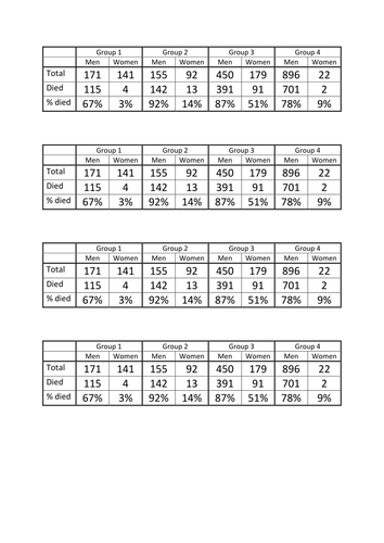
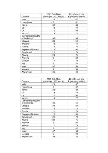
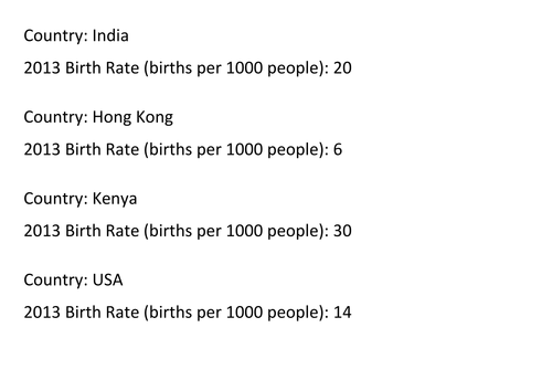
Students all pick one item of data, and discuss as a table what they could investigate. You then lead them towards scatter graphs, and provide each student with a copy of the full data set to draw a scatter graph.
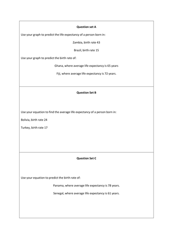
This was planned for a top set so includes equation of lines of best fit, but lots of the lesson can also be used with lower groups.
Something went wrong, please try again later.
An excellent resource, easily differentiated and ready to generate discussion <br />
Great set of resources but I am having trouble viewing the Notebook document. Is there any way you could provide a power point version of the notebook file? Thank you.
This resource has been selected to feature in the TES Secondary Maths Newsletter. Thank you so much for sharing, you are helping to inspire teachers and students all over the world!
A fantastic exploration of scatter graphs and what we can deduce from them. With a great real world starter, this activity has cross-curricular links and should appeal to most students. Comes with a great selection of activities as well, and really well differentiated. Thanks very much for sharing this great resource!
Report this resourceto let us know if it violates our terms and conditions.
Our customer service team will review your report and will be in touch.
£0.00