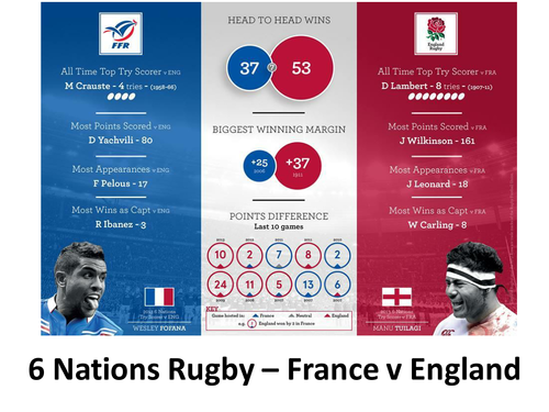

This starter is based on a statistics page from the Telegraph for the France v England fixture which makes use of pie charts. Are the pie charts as presented a fair way of presenting the data of England's 53 wins compared to France&'s 37?
A starter that you can use as a point to start discussing misleading graphs. In the past I have had students scour papers to create a misleading graphs display for me.
Something went wrong, please try again later.
Nice starter.
Report this resourceto let us know if it violates our terms and conditions.
Our customer service team will review your report and will be in touch.
£0.00